Our Philosophy
Great design is simple in its complexity and impactful in its simplicity.
Our Approach
Like the Sculptor,
our technique is unique. We begin by carefully listening to understand your brand and vision. Once we have a solid foundation, we chisel away the inessentials, leaving behind images that effectively tell your story.
Capabilities
Logo Design, Website Development, Visual Brand Identity, Print & Digital Advertising, Packaging, Signage, and more.
Who we work with

Fighting Arts Academy

T&E Construction

Ko'olau Distillery

Li's Brothers

Gladsome Records

Tailgate

Minerva Skin

Power-On Electric


Pivoting The Approach.
Fighting Arts Academy, located in Springfield, MA, is a mixed martial arts gym home to a tight-knit community of world-class fighters. Our main objective in rebranding FAA was to better communicate the balance and precision reflected in their teachings. By modernizing their logo, we were able to give it a sharp look that reflects their refined, angular technique—both inside and outside the octagon.


Mama Li, 30 Years Strong.
Run by the same family for three decades, Li’s Brothers is a Chinese & Japanese restaurant in Longmeadow, MA. We created a brand identity that views traditional Chinese aesthetics through a new hue—centered around a custom logo of a woman whose silhouette reveals her two sons, forming a bistable image that reflects the dynamic behind the restaurant’s name. This design system includes custom typography, a symbolic family seal, and a refined color palette—altogether creating a brand that’s both poetic and functional.


Where Connections Matter
Power-On Electric is a woman-owned electrical and telecom company with over 30 years of industry experience. Specializing in telecom, commercial, and residential electrical services, their expertise ensures every project is delivered with precision and reliability. The key to the logo’s design was selecting a typeface that appears clean and effortless while retaining enough strength to convey confidence and reliability. This balance reflects the brand’s commitment to professionalism and efficiency.


I rarely leave reviews; however Producingbe is very deserving of one.”
—Margaret W. Owner
Power-On Electric


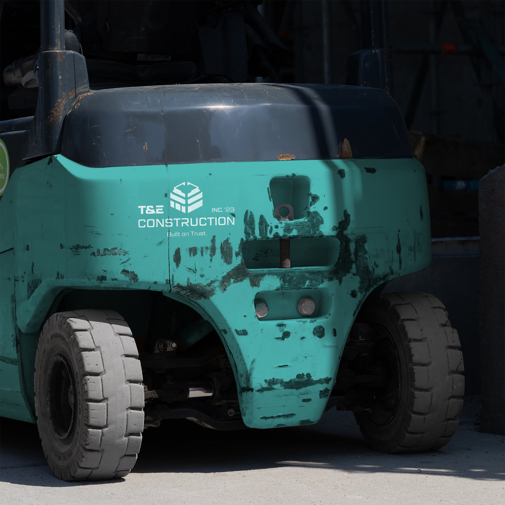
Built on Trust.
T&E Construction’s branding is built on a foundation of strength, reliability, and precision. The logo’s three-quarter view of a structure subtly integrates the letters "T&E" through clean geometry, symbolizing the company’s solid craftsmanship and trustworthiness. With a modern and confident presence, the design reflects T&E’s commitment to integrity and excellence—values that are carried through in every project.

Highly attentive and detail-oriented, open to feedback, and produced an outstanding visual identity.”
—Tiana F.
T&E Construction


They Don’t Make 'em Like They Used To.
Our focus in the Tailgate project was the restoration of a weathered 1950's Buick Roadmaster. Our aim was to create a clean and approachable feel while still preserving the nostalgia of a simpler time. Rather than following trends, our aim was to highlight Tailgate's ability to maintain an old-fashioned, hometown feel.


Crafted in Paradise, Sipped Worldwide.


Luxury Aesthetics.
For Minerva, based in Somers, CT, we crafted a brand that reflects the luxury experience and effects of their skincare procedures. We began by selecting a sophisticated typeface, strategically altering and refining its structure and letterform weight to create a clean logotype that ensures both maximum legibility and memorability.
Producingbe took the time to help me every step of the way, from concept to seeing the brand come to life.”
—Marissa C.
Minerva Skin


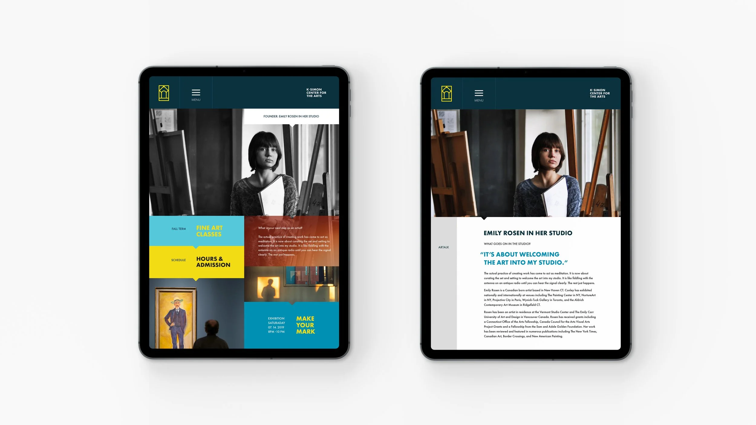
From the Ground Up.
KSCA is a dynamic space that provides a platform for local artists to showcase their work, while also offering diverse art classes to the community. Our logo design embodies the spirit of their mission, by seamlessly integrating elements of the building's unique architecture with a pencil, to represent the creativity and inclusivity of KSCA's programs.